KAT Milkshake

Technical characteristics
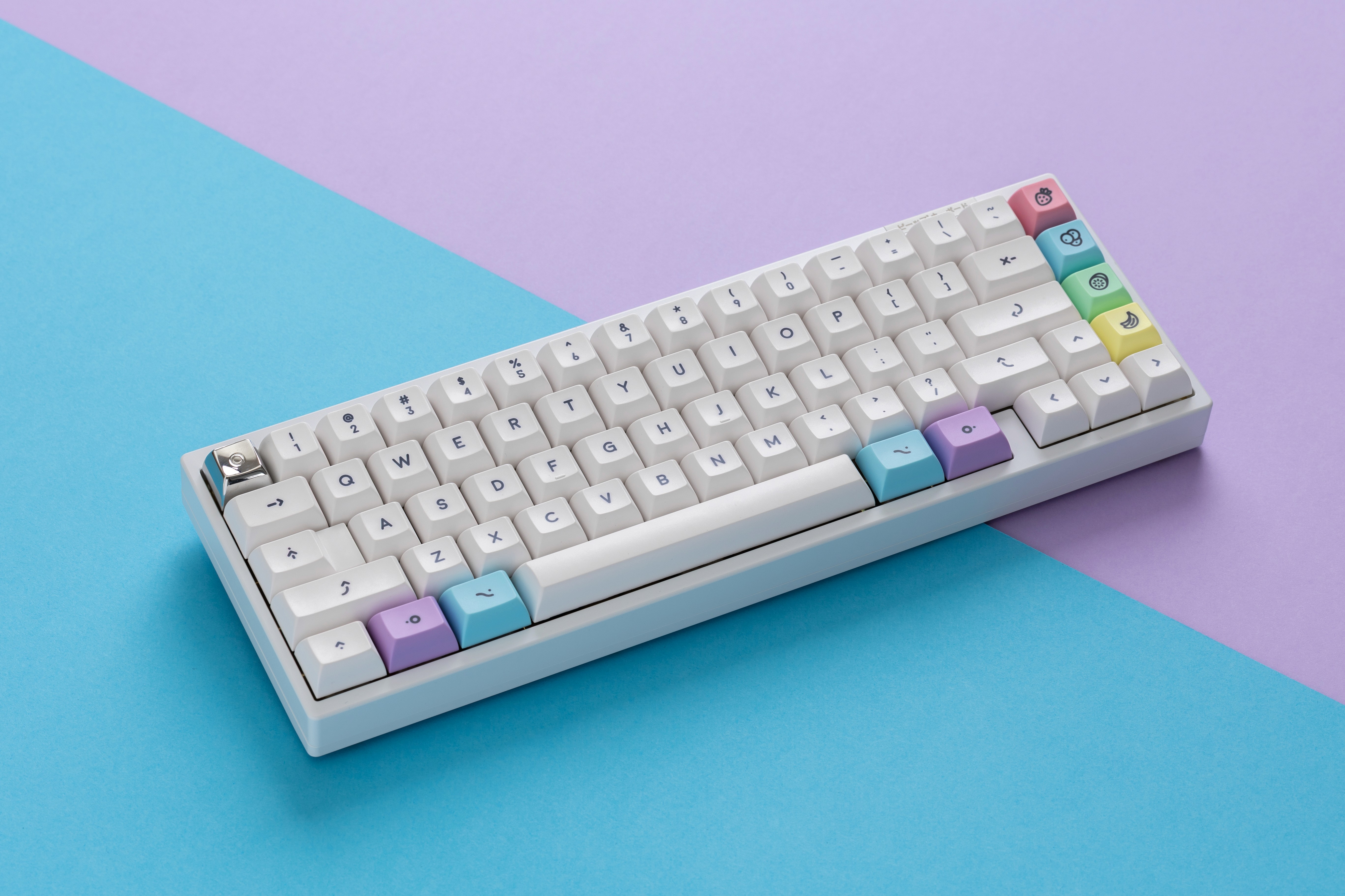
KAT Milkshake: Rounded typography & pastel colors capture classic milkshake drink vibes.
I chose KAT because the taller, rounder, smoother, sculpted shape of this profile reminds me of classic tall milkshake glasses. The curved tops of the KAT keycaps echo the rounded, bubbly foam that sits on top of a perfectly made milkshake, which makes this profile a natural fit for the theme.
I wanted to create something that felt both nostalgic and fresh at the same time. The name "Milkshake" came from that creamy, sweet feeling I was going for with the color palette. My goal was to design a set that would make people smile when they looked at their keyboard.
It is a playful keycap set that brings together soft pastels and colorful fruit-inspired accents. The base uses slightly warm off-white keycaps with rounded uppercase lineal dark legends that create excellent readability while maintaining a gentle, approachable look.
The keyset also features a custom handcrafted font called "Weirdos," which is based on a(ny) classic sans-serif rounded font but has had sections of the letters removed to create a unique, singular look. The result is a sci-fi but minimalistic looking font that perfectly matches the organic and playful modifiers icons. This addition further enhances the overall tone of the set, making it a truly one-of-a-kind keycaps set that is sure to stand out.